on this occasion the techno educator will try to explain about : The Anatomy of a Business Intelligence Dashboard Business intelligence (BI) dashboards are an essential tool for businesses to analyze data and make informed decisions. A BI dashboard is a graphical user interface that displays the key performance indicators (KPIs) and metrics relevant to a business. It enables users to access real-time data insights that help them to monitor and optimize business operations. This article will delve into the anatomy of a business intelligence dashboard, including its components, types, and best practices.
Components of a Business Intelligence Dashboard
A typical BI dashboard comprises the following components:
Data Source
The data source is the foundation of a BI dashboard. It can be a database, data warehouse, cloud storage, or any other source of structured data. The data source must be reliable, accurate, and up-to-date to ensure the dashboard’s insights are trustworthy.
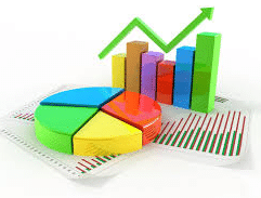
Data Visualization
Data visualization is the process of presenting data in a graphical format such as charts, graphs, and tables. The primary purpose of data visualization in a BI dashboard is to make complex data sets more accessible and understandable.
KPIs and Metrics
Key performance indicators (KPIs) and metrics are the most crucial elements of a BI dashboard. They represent the data points that businesses track to evaluate their performance against specific goals. Examples of KPIs and metrics include revenue, customer acquisition cost, conversion rate, and churn rate.
Filters
Filters are essential for a BI dashboard as they enable users to interact with the data and get more detailed insights. Filters can be used to segment data based on time, location, product, or any other relevant parameter.
Alerts
Alerts are notifications that are triggered when a particular KPI or metric exceeds or falls below a predefined threshold. Alerts enable users to respond quickly to critical business events and take corrective actions.
Dashboards
Dashboards are the user interface of a BI tool that displays the KPIs, metrics, data visualization, and other components of the BI dashboard. Dashboards can be customized to fit the specific needs of different business units and stakeholders.
Types of Business Intelligence Dashboards
There are different types of BI dashboards, each serving a specific purpose. Here are the main types of BI dashboards:
Operational Dashboards
Operational dashboards provide real-time insights into the operational aspects of a business, such as sales, inventory, production, and customer service. Operational dashboards enable businesses to monitor their day-to-day activities and take immediate actions.
Strategic Dashboards
Strategic dashboards provide insights into the strategic aspects of a business, such as long-term goals, trends, and forecasts. Strategic dashboards enable businesses to make informed decisions about their future based on data-driven insights.
Analytical Dashboards
Analytical dashboards provide insights into complex data sets, such as market trends, customer behavior, and business performance. Analytical dashboards enable businesses to gain a deeper understanding of their business and make informed decisions based on data insights.
Best Practices for Creating a Business Intelligence Dashboard
Creating an effective BI dashboard requires careful planning and attention to detail. Here are some best practices to follow when creating a BI dashboard:
Define Your Objectives
Before creating a BI dashboard, you should define your objectives and identify the KPIs and metrics that are most relevant to your business. This will ensure that your dashboard provides actionable insights that align with your business goals.
Keep It Simple
A BI dashboard should be easy to use and understand. Avoid cluttering your dashboard with too much information or complex data sets. Instead, focus on presenting the most critical KPIs and metrics in a clear and concise manner.
Use Interactive Features
Interactive features such as filters, alerts, and drill-downs can make your dashboard more engaging and enable users to explore the data
Ensure Data Accuracy
The data source of your BI dashboard must be reliable and accurate. Regularly monitor and validate your data to ensure that the insights provided by your dashboard are trustworthy.
Use Data Visualization Effectively
Data visualization is an essential element of a BI dashboard. However, it’s crucial to use it effectively. Choose the right charts and graphs that best represent the data, and avoid using too many visualizations that could make the dashboard cluttered and confusing.
Customize Your Dashboard
Different stakeholders in your business will have varying needs and requirements. Customize your dashboard to fit the specific needs of different user groups, such as executives, managers, and frontline employees.
Test and Iterate
Testing and iterating your BI dashboard is essential to ensure that it provides valuable insights and meets the needs of your business. Continuously monitor the performance of your dashboard and make improvements based on user feedback.
Conclusion
In conclusion, a business intelligence dashboard is a powerful tool for businesses to gain real-time insights into their operations and make data-driven decisions. The components of a BI dashboard include a reliable data source, data visualization, KPIs and metrics, filters, alerts, and dashboards. There are different types of BI dashboards, including operational, strategic, and analytical dashboards. To create an effective BI dashboard, follow best practices such as defining your objectives, keeping it simple, using interactive features, ensuring data accuracy, customizing your dashboard, and testing and iterating.
FAQs
- What is the difference between a KPI and a metric? A KPI is a specific metric that is tracked to evaluate the performance of a business against a specific goal or objective.
- Can I use a BI dashboard for personal use? Yes, you can use a BI dashboard to analyze personal data, such as fitness and financial data.
- How do I choose the right data visualization for my dashboard? Choose the data visualization that best represents the data and is easy to understand. Bar charts are ideal for comparing data, while line charts are suitable for showing trends over time.
- How often should I update my BI dashboard? It depends on the frequency of data updates and the needs of your business. Some businesses update their dashboard in real-time, while others update it daily, weekly, or monthly.
- Can I create a BI dashboard without technical expertise? Yes, there are many user-friendly BI dashboard tools available that do not require technical expertise. However, it’s important to have a basic understanding of data analytics and visualization to create an effective dashboard.